- 1,900

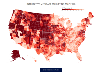
Interactive Medicare Marketing Map 2017
I spoke with several agents who enjoyed the simplified list I had on my web site of the Medicare Advantage penetration percentage per county.
I recently updated the list with data from 2017, including all counties in the US (not just the counties below 40% that I had listed previously). I also included the total number of Medicare eligibles per county to assist in gauging the population per county.
I had this map built to make the area selection process a little easier for everyone ordering Medicare Supplement leads, however anyone is welcome to use this map for their own area marketing analysis/selection!
I recommend picking a county (or counties) with a Medicare Advantage % that is 30% or less to avoid too many seniors who think they have a supplement plan, when they actually have an advantage plan.
When you highlight a county, you will see the following information:
County Name, State Name
Penetration '%'
Eligibles '#'
Note: If you are viewing on a mobile device - you will be able to see the map but the interactive feature does not work at this time. You can still view the data set that the map was built with by clicking the button below the map.


